A conversation worth bringing into your plans
Recent bathroom coverage returns to a useful relationship: materials and lighting work together. Tile and Stone Journal’s 28 October article considers how tile finishes respond to light, while a renovation guide published by MLCRL on 30 October also advocates layered bathroom lighting. The recurring theme is coordination, rather than choosing each element independently.
This is a reading of current editorial coverage, not a ranking based on UK search demand. For your own bathroom, the useful starting point is simple: decide how you want to use the room in the morning and evening, then assess the surfaces under those conditions.
Look beyond the sample in your hand
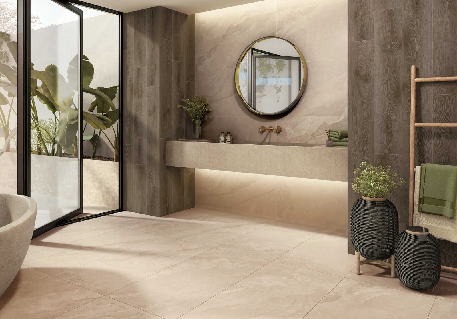
A tile viewed flat on a table can look different when held vertically beside a mirror. Position samples as they will be installed, with proposed paint, vanity and metal finishes nearby. Look from the doorway and from the basin, where reflections may be more noticeable.
Repeat the comparison after dark using the intended lighting where possible. Record the fitting and setting used so that later comparisons are meaningful. A phone photograph can help recall an arrangement, but make the colour decision in person rather than relying on a screen.
Compare the finish, not just the colour
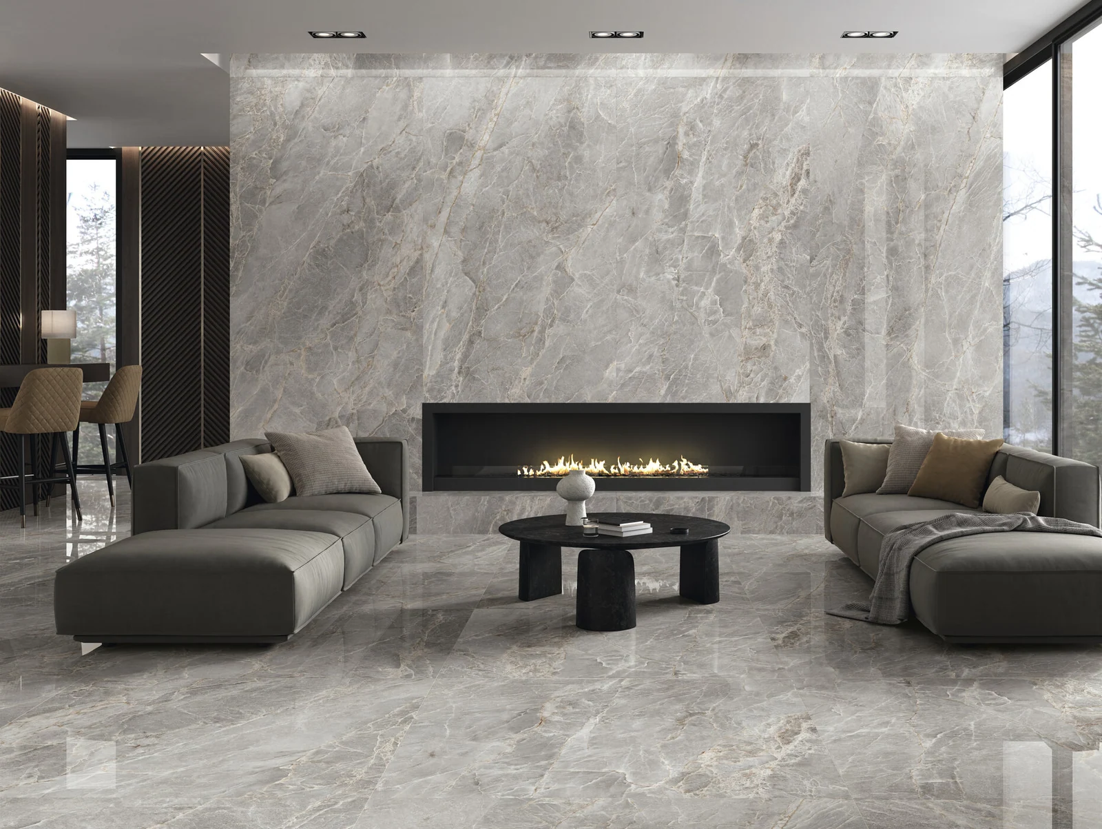
Majesty provides a useful starting point for comparing surface choices. The current catalogue includes Grey, Cream and Pearl porcelain in both polished and matt 60 × 120 cm variants. Assess the exact finish you intend to order: the same colour name does not make the two surfaces visually interchangeable.
For quieter stone character, Calla offers matt porcelain in Beige, Grey and Ivory, with 60 × 60 cm and 60 × 120 cm options. Put a shortlist beside your other finishes and ask which combination feels comfortable in the room. Choose for that relationship rather than expecting a particular finish to solve the lighting.
Give texture room to be understood
Cosmo offers White and Green porcelain in a 22.3 × 22.3 cm format, with a matt surface and gloss detail. Its Shape Tech texture follows the design. This makes it a relevant sample to inspect from several angles, particularly if you are considering lighting near a decorative surface.
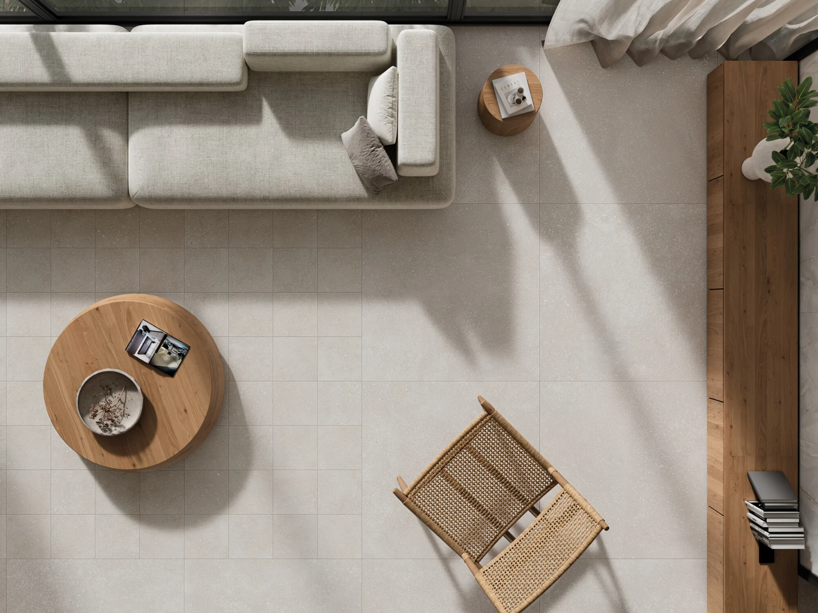
Ask to see more than one tile where possible. Include grout in the comparison and consider the complete area, not only a close-up. Manufacturer interiors can establish a direction, but they may include formats or coordinating products outside your selection; check the caption and exact product details.
Resolve the junctions before work starts
Bring the tile layout and lighting plan to the same conversation with your designer, tiler and electrician. Mark mirrors, niches, shelves and the edges of tiled areas. Agree where fittings and any profiles meet the tile so that cuts, corners and access requirements can be considered together.
Ask to review the proposed effect before the finishes are completed. Have the electrician specify equipment appropriate to its location and the installation. Keep the design brief focused on what you need to see and how you want the room to feel; the technical specification should follow from that brief.
Make one clear decision at a time
Start with the main surface, compare a small number of finishes, then confirm the lighting alongside the preferred samples. Keep a record of the selected collection, colour, format, finish and grout. Floor and wet-area suitability still need checking for the exact product; appearance alone cannot establish them.
A successful scheme does not require every surface to demand attention. It needs enough light for everyday routines and a material palette you enjoy under it. Samples, a coordinated plan and carefully resolved details give that decision a firmer foundation.
See the material for yourself
Bring your ideas into focus.
Choose up to three samples, or talk us through the room you’re planning. Sample availability and delivery arrangements are confirmed separately.